Design System & Component Library
A centralized library of scalable UI components, style tokens, and design patterns that accelerates development and ensures consistency across all products and teams
Key features
Create scalable design systems with reusable components that guarantee consistency, speed up delivery, and maintain quality across projects:
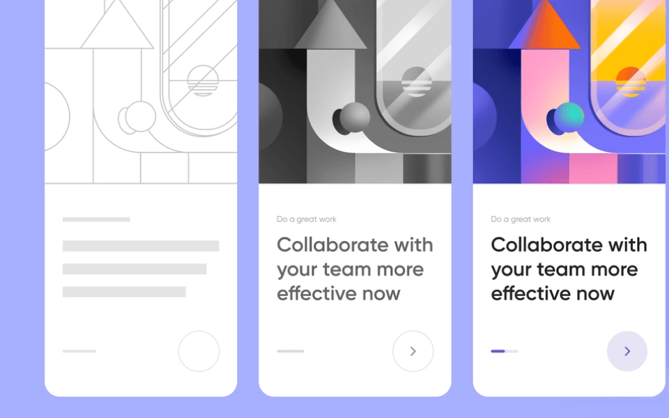
Reusable Components
Scalable components ensure consistent UI delivery
Build once, reuse everywhere—ensuring design consistency, reducing duplication, and accelerating development across projects
Unified Guidelines
Centralized design rules improve efficiency and clarity
Define standardized visual and functional guidelines that streamline collaboration between designers and developers for faster delivery
Brand Consistency
Maintain brand identity across all platforms seamlessly
Ensure every element matches brand identity by enforcing design consistency across apps, websites, and digital platforms
Rapid Prototyping
Prebuilt elements accelerate prototyping and testing
Reduce time-to-market by using ready design elements for rapid prototyping and faster iteration cycles with stakeholders
Developer Handoff
Smooth design-to-code transition with clear specifications
Simplify developer handoff with documented components, reducing errors and enabling quicker, cleaner code implementation
Cross-Platform Design
One library powers apps across web, mobile, and desktop
Create adaptable design libraries that scale across multiple platforms, ensuring user familiarity and reducing design overhead
Version Control
Track changes and maintain updated design libraries
Keep design assets up-to-date with versioning systems that ensure alignment and eliminate outdated components in projects
Accessibility Ready
Inclusive components meet accessibility standards
Deliver accessible digital experiences with components designed to comply with WCAG guidelines and inclusive best practices


